Subject: Internet Banking System – Single-Page Application (SPA) Module
This guide provides a comprehensive methodology for transitioning from Level 2 (Container Diagrams) to Level 3 (Component Diagrams) within the C4 Model framework. Using the provided Internet Banking System as a case study, we demonstrate how to "zoom in" on the Single-Page App container to reveal its internal client-side architecture, logical groupings, and interaction patterns.
💡 Quick Win: Component diagrams are living documents. Update them as your code evolves, or they become technical debt rather than technical assets.
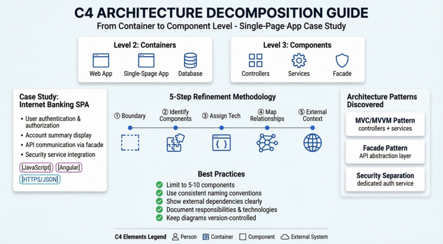
The C4 model visualizes software architecture at four levels of abstraction. This guide focuses on the critical transition between the middle two layers:
@startuml
!include https://raw.githubusercontent.com/plantuml-stdlib/C4-PlantUML/master/C4_Container.puml
' uncomment the following line and comment the first to use locally
' !include C4_Container.puml
' LAYOUT_TOP_DOWN()
' LAYOUT_AS_SKETCH()
LAYOUT_WITH_LEGEND()
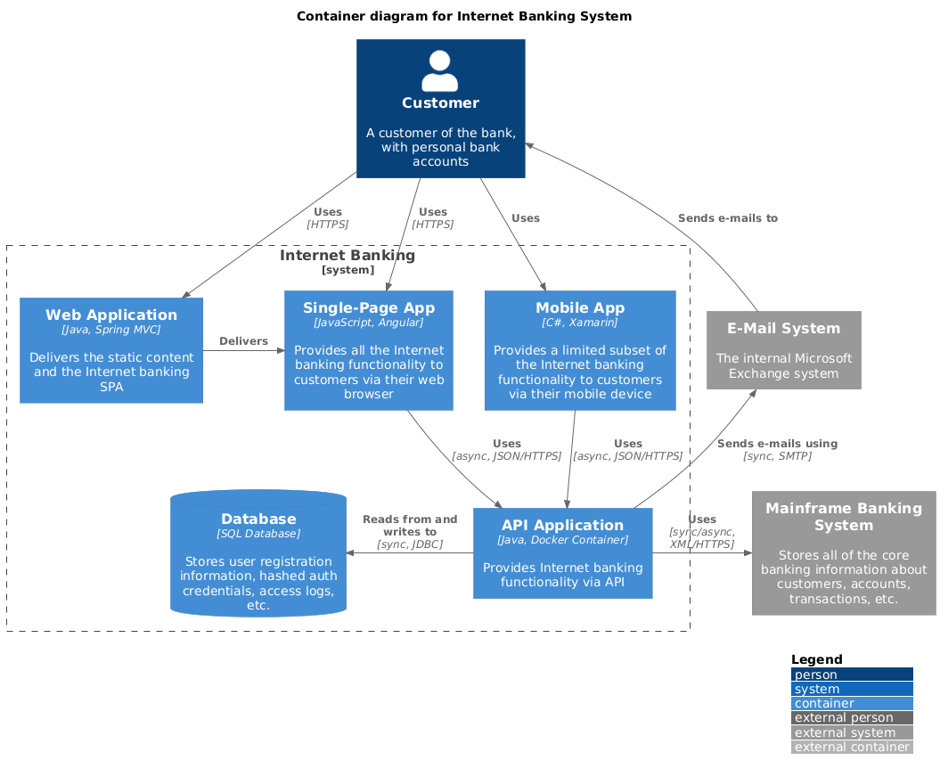
title Container diagram for Internet Banking System
Person(customer, Customer, "A customer of the bank, with personal bank accounts")
System_Boundary(c1, "Internet Banking") {
Container(web_app, "Web Application", "Java, Spring MVC", "Delivers the static content and the Internet banking SPA")
Container(spa, "Single-Page App", "JavaScript, Angular", "Provides all the Internet banking functionality to customers via their web browser")
Container(mobile_app, "Mobile App", "C#, Xamarin", "Provides a limited subset of the Internet banking functionality to customers via their mobile device")
ContainerDb(database, "Database", "SQL Database", "Stores user registration information, hashed auth credentials, access logs, etc.")
Container(backend_api, "API Application", "Java, Docker Container", "Provides Internet banking functionality via API")
}
System_Ext(email_system, "E-Mail System", "The internal Microsoft Exchange system")
System_Ext(banking_system, "Mainframe Banking System", "Stores all of the core banking information about customers, accounts, transactions, etc.")
Rel(customer, web_app, "Uses", "HTTPS")
Rel(customer, spa, "Uses", "HTTPS")
Rel(customer, mobile_app, "Uses")
Rel_Neighbor(web_app, spa, "Delivers")
Rel(spa, backend_api, "Uses", "async, JSON/HTTPS")
Rel(mobile_app, backend_api, "Uses", "async, JSON/HTTPS")
Rel_Back_Neighbor(database, backend_api, "Reads from and writes to", "sync, JDBC")
Rel_Back(customer, email_system, "Sends e-mails to")
Rel_Back(email_system, backend_api, "Sends e-mails using", "sync, SMTP")
Rel_Neighbor(backend_api, banking_system, "Uses", "sync/async, XML/HTTPS")
@enduml
@startuml
!include <C4/C4_Component>
LAYOUT_WITH_LEGEND()
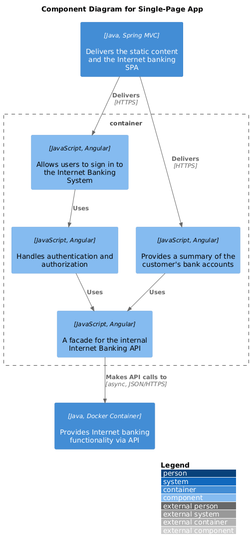
title Component Diagram for Single-Page App
Container(web_app, "Web Application", "Java, Spring MVC", "Delivers the static content and the Internet banking SPA")
Container(backend_api, "API Application", "Java, Docker Container", "Provides Internet banking functionality via API")
Container_Boundary(spa_boundary, "Single-Page App") {
Component(sign_in_controller, "Sign In Controller", "JavaScript, Angular", "Allows users to sign in to the Internet Banking System")
Component(accounts_summary_controller, "Accounts Summary Controller", "JavaScript, Angular", "Provides a summary of the customer's bank accounts")
Component(security_service, "Security Service", "JavaScript, Angular", "Handles authentication and authorization")
Component(banking_api_facade, "Banking API Facade", "JavaScript, Angular", "A facade for the internal Internet Banking API")
}
Rel(web_app, sign_in_controller, "Delivers", "HTTPS")
Rel(web_app, accounts_summary_controller, "Delivers", "HTTPS")
Rel(sign_in_controller, security_service, "Uses")
Rel(accounts_summary_controller, banking_api_facade, "Uses")
Rel(security_service, banking_api_facade, "Uses")
Rel(banking_api_facade, backend_api, "Makes API calls to", "async, JSON/HTTPS")
@enduml
| Level | Audience | Detail | Purpose |
|---|---|---|---|
| Container | Architects, DevOps, Stakeholders | Deployment units | Technology decisions, infrastructure |
| Component | Developers, Tech Leads | Code organization | Implementation guidance, code structure |
⚠️ Common Pitfall: Don't confuse "Container" (C4 term) with "Docker Container." In C4, a container is any independently deployable unit (web app, mobile app, database, file system, etc.).
Reference: Top left section ("Container diagram for Internet Banking System")
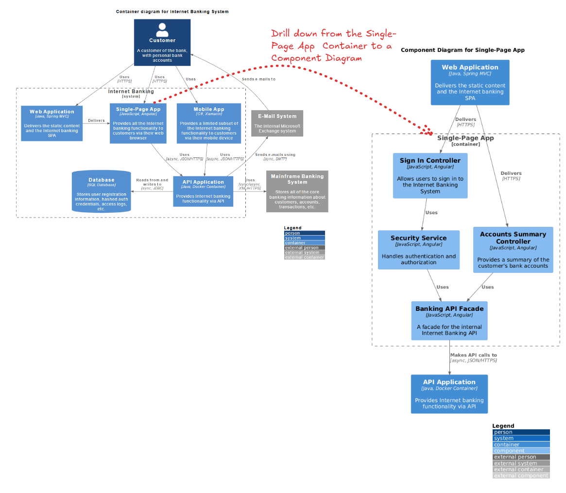
Before refinement, we analyze the Single-Page App container to understand its high-level responsibilities.
The Goal: We need to understand how the Single-Page App achieves these responsibilities. How is the UI organized? How is security handled on the client side? How does it talk to the backend?
Before you start decomposing, ask:
💡 Tip: Not every container needs a component diagram. Focus on containers that are:
- Complex or critical to the business
- Worked on by multiple teams
- Have strict compliance/security requirements
- New or undergoing major refactoring
The following 5-step process details how to transform the high-level container box into a detailed component diagram.
Draw a dashed boundary line representing the container you are decomposing.
⚠️ Pitfall Alert: Don't include external libraries or frameworks as components inside your boundary unless they're custom wrappers you've built. React, Angular, Vue, etc. are technologies, not your components.
Break the container down into cohesive units of functionality. For a Single-Page App (SPA), this usually follows an MVC (Model-View-Controller) or MVVM pattern.
Strategy 1: By Responsibility
── Authentication Components
── Business Logic Components
── Data Access Components
── UI Components
Strategy 2: By Feature/Domain
── Account Management
── Transaction Processing
── User Profile
── Reporting
Strategy 3: By Layer (Recommended for SPAs)
── Presentation (Controllers/Views)
── Application Services
── Domain Services
── Infrastructure (API clients, storage)
💡 Pro Tip: Aim for 5-10 components per diagram. Too few means you're still at container level; too many means you're too deep (heading toward class diagrams).
⚠️ Warning Signs:
- God Component: One component that does everything (too broad)
- Anemic Components: Components with no real responsibility (too narrow)
- Circular Dependencies: Components that depend on each other (architectural smell)
For each component, define its specific job and the technology stack used.
DO:
SecurityService - Clear, descriptiveBankingApiFacade - Pattern + purposeSignInController - Action + typeAccountSummaryComponent - Domain + typeDON'T:
Service1, Manager2 - MeaninglessUtils, Helpers - Catch-all anti-patternAuthenticationSecurityService - RedundantCtrl - Unclear abbreviationWrite responsibilities using this template:
"[Component Name] [verb] [object] [purpose/constraint]"
Examples:
💡 Tip: Use active verbs: manages, handles, coordinates, validates, transforms, caches, orchestrates
Draw arrows between components to show data flow and dependencies.
Use these standard relationship types:
| Relationship | When to Use | Example |
|---|---|---|
| Uses | General dependency | Controller uses Service |
| Reads from | Data access | Component reads from Cache |
| Writes to | Data modification | Service writes to Database |
| Sends to | Messaging/Events | Service sends to Queue |
| Notifies | Observer pattern | Service notifies UI |
| Validates | Security/Validation | Service validates Token |
| Delegates to | Delegation pattern | Controller delegates to Service |
⚠️ Common Mistake: Don't label every relationship with detailed protocol information unless it's architecturally significant. "Uses" is often enough. Save "[async, JSON/HTTPS]" for external boundaries or critical performance paths.
A Component diagram must show what the internal components talk to outside the boundary.
DO:
DON'T:
💡 Pro Tip: External systems are your "ports and adapters." They're where your architecture meets the real world. Make them visible and explicit.
Reference: Right side section ("Component Diagram for Single-Page App")
The refinement reveals a structured client-side architecture that was hidden in the Container diagram.
The diagram reveals a clear separation of concerns typical of Angular applications:
When reviewing your diagram, look for these patterns:
Layered Architecture:
Presentation → Application → Domain → Infrastructure
Hexagonal/Ports & Adapters:
        [External Systems]
              ↓ ↑
    [Primary Adapters (Controllers)]
              ↓ ↑
        [Domain Logic]
              ↓ ↑
    [Secondary Adapters (API Clients)]
              ↓ ↑
        [External Systems]
Clean Architecture:
        [Frameworks/Drivers]
              ↓ ↑
            [UI]
              ↓ ↑
     [Application Business]
              ↓ ↑
      [Enterprise Business]
💡 Tip: Your component diagram should make the architectural pattern obvious at a glance. If it doesn't, you may have architectural drift.
A key architectural decision revealed here is the Banking API Facade.
Use a Facade when:
Don't use a Facade when:
⚠️ Warning: Don't create "leaky facades" that expose all underlying complexity. A facade should simplify, not just pass through.
The diagram explicitly separates security logic into a Security Service.
If your system has security requirements, ensure you have:
💡 Best Practice: Security components should be highly visible in your diagram. They're critical to review during architecture reviews and security audits.
Good Component Diagram:
Red Flags:
Visual Paradigm's AI-Powered C4 PlantUML Studio is a cloud-based design tool that automates software architecture documentation. It combines the hierarchical clarity of the C4 model (Context, Container, Component, and Code) with the efficiency of PlantUML script-based rendering.
It addresses the common issue of architecture documentation becoming outdated. By using text-based PlantUML, diagrams are easier to maintain, version-control in Git, and align across different technical and business stakeholders.
Your component diagram should live in:
⚠️ Warning: A diagram that's not maintained is worse than no diagram at all. It creates false confidence. Assign ownership and review diagrams quarterly.
Maintenance Strategies:
1. Architecture Reviews:
2. Automated Validation:
3. Documentation Sprints:
4. Change Triggers:
Update your diagram when:
| Pitfall | Symptom | Solution |
|---|---|---|
| Too Much Detail | Diagram looks like a class diagram | Step back; group related classes into components |
| Too Little Detail | Just boxes with names | Add responsibilities, technologies, relationships |
| Inconsistent Abstraction | Some components are modules, others are classes | Choose one level and stick to it |
| Missing Context | Can't see external systems | Always show what's outside the boundary |
| Outdated Diagram | Doesn't match the code | Implement review process; automate where possible |
| Unclear Purpose | Diagram doesn't aid understanding | Define audience and goal before creating |
| Over-Engineering | 20+ components in one diagram | Split into multiple focused diagrams |
Refining a Container diagram into a Component diagram is an exercise in architectural transparency. By following the decomposition workflow outlined above, architects can move from high-level deployment views to detailed implementation views.
In this specific case, we uncovered how a JavaScript/Angular SPA is organized into Controllers, Services, and Facades to ensure maintainability and security.
💡 Final Thought: A good component diagram is a communication tool, not an artifact. Its value is measured by how well it helps your team understand, build, and maintain the system.
📖 Further Reading:
🔗 Resources: