Building a digital presence ‒ on the web or within a mobile application ‒ is important for an organization of any kind. What do you experience while navigating a modern website or application? Color, features, look & feel, and responsive layout all make a massive difference that the desktop and web applications don’t look like they did in 10 years ago, as many companies hire UI designers to design and enhance the user experience of their IT applications.
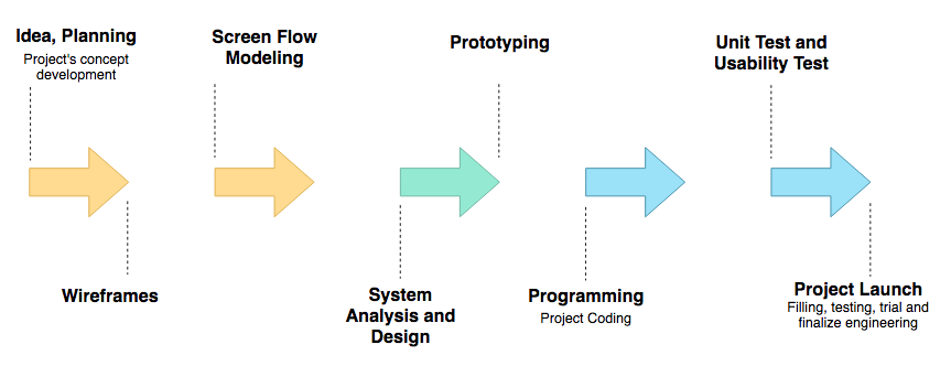
Why UX is becoming so important for business? For example, at the initial stage of a software project, the development team needs to confirm whether the proposed features record as requirement is going to meet the needs of their customers. But simply describing to them verbally or textually for the targeted features to be built may be quite challenging for their imagination. In order to confirm the features they are going to develop in the product backlog are what the users expected in mind, we can adopt some useful UX design tools along the system development path from initial wireframes design to high-fidelity prototyping to ensuring the “work-in-progress” is moving forward to the right direction. To do this, the team can get early feedback from the end users and saving costs while minimize the development risks. This article shows you how to adopt these tools and techniques in different 3 UX development stages:
Initial Stage: Ideation and Confirmation of requirement and users features
Detailed Design Stage: Screen Flow Design and Verification
Prototype Demonstration Stage: High-Fidelity GUI Design and product demonstration

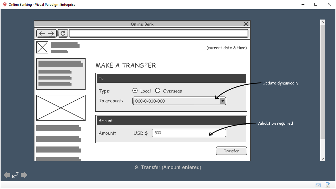
A wireframe is a sketch of the system to be built. It’s simple, clear and allows everyone to read and understand easily. Wireframe shows “just enough” information of the screen instead of the full details. The actual screen design will be produced at a later stage by referencing the wireframe. You can show the scenario to your customer visually to obtain consent about the requirements. They serve as a blueprint that defines each Web page’s structure or screen design, content and functionality. Wireframes are created before any design work is started so that the focus is on layout without the distraction of color and visual elements.

Comparing to prototyping or any kind of detailed screen designs, wireframe features the following advantages:
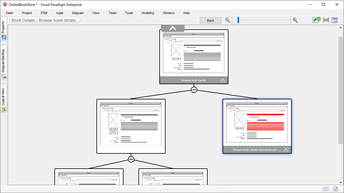
A storyboard is a visual depiction of the scenes, dialog, action in a sequential order. It is a method used to mock up ideas, designs and concepts for websites typically presenting a sequence of wireframes in a particular order which you have already developed in the earlier development stage.
It helps UX developers plan and mockup user features in a sequential order as a lightweight ideation process for getting early feedbacks before heavy development put forward for implementation the website. Storyboard is an engaging way to present how users can interact with the system. It is an inexpensive way to confirm requirements up front.
Traditionally, Powerpoint is often a common tool used to create storyboards to present of the new features of a system to their users, and now there are automated software to simplify the entire storyboarding design process.

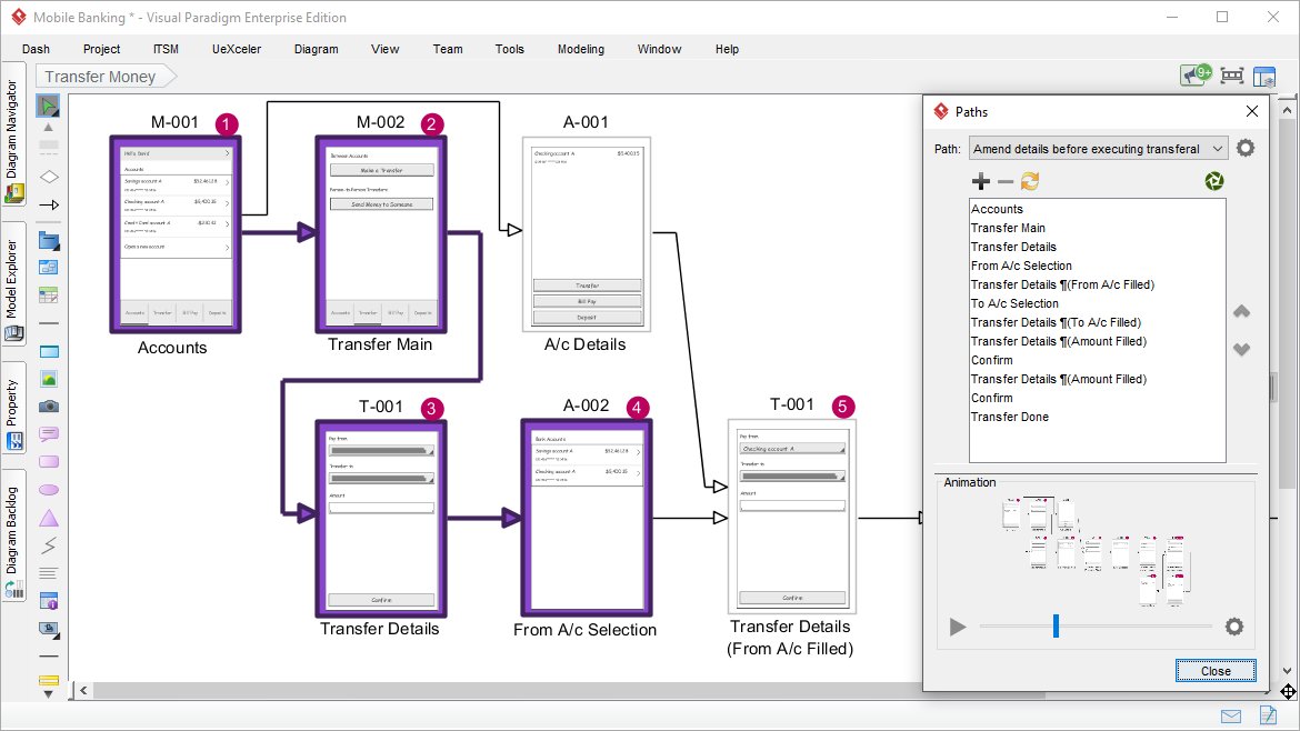
Wireflow is the representation of screen flow, by putting together a set of related wireframes following the order they appear in the flow. The use of decision (shape) in a wireflow makes it possible to present multiple navigation paths in a single flow. In short, wireflows are a combination of wireframes and flowcharts.
Wireflows are used primarily in UX design for mobile apps, which often involves complex user workflows and interactions focused in just a few pages. In the past few years, the wireflow technique has emerged as a solution to address this problem, used to show designs in the context of common user tasks. It is particularly useful for documenting workflow and screen designs when there are few pages that change dynamically.

A mockup is high-fidelity static design for representing a product. While a wireframe mostly represents a screen or webpage structure, a mockup shows how the actual screen is going to look like. A mockup helps you make final decisions regarding a screen’s color schemes, or the layout of visual GUI elements, but it is not interactive and not clickable.
While wireframes are design placeholders, mockups are built to give the viewer a more realistic impression of how the end product will look. While the wireframe is visually stunted, the mockup is close to the final version in appearance. In this way the mockup acts as the bridge between the wireframe and the prototype.
Although it lacks the functionality of a prototype, it can still provide the project sponsor with a picture of how a finished product can be, and help team members review their project visually. Thus, you can ask your potential users for feedback and make the necessary changes right away.
A prototype is a draft version of a product that allows you to explore your ideas and show the intention behind a feature or the overall design concept to users before investing time and money into development. A prototype can be anything from paper drawings (low-fidelity) to something that allows click-through of a few pieces of content to a fully functioning site (high-fidelity).
A prototypes are computer-based, and usually allow realistic (mouse-keyboard) user interactions. High-fidelity prototypes take you as close as possible to a true representation of the user interface. High-fidelity prototypes are assumed to be much more effective in collecting true human performance data (e.g., time to complete a task), and in demonstrating actual products to clients, management, and others. Here are the benefits of a high-fidelity prototypes: